
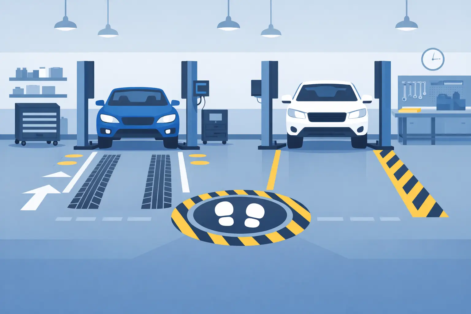
A service bay floor graphics example should do more than add color to concrete. In a working shop, the floor is part of the process. It tells drivers where to stop, gives technicians a clearer work zone, and helps every customer understand where they should and should not walk. When the message is simple and the material is made for the environment, a floor graphic becomes a practical operational tool.
What a Good Service Bay Floor Graphic Looks Like
The most effective graphics are easy to understand from a vehicle windshield or from several feet away. A customer pulling into an oil change lane should not need to guess where the tires belong. A large, high-contrast pair of tire-position markers with “STOP HERE” can reduce hesitation and keep the intake process moving.
For an auto repair shop or dealership, the graphic may define a customer handoff point instead. A rectangular decal outside the active work area that reads “Please Wait Here for Service Advisor” creates a clear boundary without adding another sign stand or rope barrier. This is especially useful during busy morning drop-off periods, when staff are moving vehicles and customers are arriving at the same time.
The graphic should suit the job it needs to perform. A bright logo placed in the middle of a lift bay may look good in a photo, but it can be the wrong choice if it competes with positioning marks, gets covered by vehicles all day, or sits in a high-abrasion area. Function comes first. Branding works best when it supports the customer experience rather than getting in the way of daily service.
Example: Drive-In Oil Change Lane
A quick-lube business can use two long floor decals, one on each side of the lane, to guide tire placement. At the stopping point, a bold graphic can say “STOP” with the shop logo below it. Ahead of the vehicle, a smaller message such as “Stay in Vehicle Until Directed” helps staff control the process and gives customers a clear instruction before service begins.
This layout works because each message appears where it is needed. The tire guides are visible during approach. The stop marker is visible at the exact decision point. The customer instruction is placed after the vehicle is parked. It is simple, repeatable, and easy to train staff around.
Example: Dealership Service Drive
A dealership service drive often needs to manage more than one vehicle at a time. Floor graphics can label lanes by purpose, such as “Appointment Check-In,” “Express Service,” or “Tire Service.” A branded welcome graphic near the service advisor station can reinforce a professional first impression without taking up wall or counter space.
In this setting, avoid placing too much copy on the floor. Customers may be focused on finding their advisor, handling keys, or getting children out of the vehicle. Large lane labels and directional arrows are usually more useful than detailed instructions. Let staff handle the conversation while the graphics handle orientation.
Start With Workflow, Not Artwork
Before choosing colors, logos, or shapes, walk the service path from the customer’s point of view. Where does the vehicle enter? Where does it stop? Which way does the driver exit? Where do technicians cross the lane? Where are customers likely to stand while waiting for help?
A floor graphic should solve one of those real movements. If the issue is cars stopping too far forward, use a tire stop-position graphic. If customers regularly walk into a work area, mark a waiting zone or pedestrian route. If multiple bays cause confusion, identify each bay clearly. Trying to solve every problem with one oversized decal usually creates clutter instead.
It also helps to separate permanent needs from short-term promotions. Bay numbers, directional arrows, and safety reminders are long-term operational graphics. A seasonal tire change promotion or detailing offer may be better placed near a reception area, where it can be updated without disrupting the flow of vehicles.
Design for Visibility and Daily Wear
Service bays are demanding spaces. Water, road salt, oil residue, tire traffic, cleaning products, and heavy foot traffic can all affect graphic life. The right floor material and surface preparation matter as much as the design itself.
High contrast is a practical starting point. Dark text on a light graphic, or light text on a dark graphic, is easier to read under changing shop lighting. Yellow, white, red, and black are commonly used because they create clear visual separation, but the final color choice should account for the floor color and existing shop markings.
Keep lettering large. A short instruction in a bold typeface will usually outperform a detailed paragraph. “STOP HERE,” “KEEP CLEAR,” “CHECK-IN,” and “WAIT HERE” are direct messages that drivers and customers can process quickly. If a logo is included, make sure it does not reduce the size or visibility of the instruction.
Shape can also reinforce meaning. Arrows communicate direction. Circles or target-style markers communicate stopping position. Rectangles help define waiting areas and parking zones. When the shape matches the purpose, the graphic can be understood even before someone reads the words.
Placement Decisions That Prevent Problems
A floor graphic needs a clean, sound surface to perform properly. Cracked, flaking, wet, heavily textured, or contaminated concrete may not be suitable for every adhesive product. Before installation, assess the floor condition and confirm that the selected material is intended for the traffic and surface involved.
Placement requires some judgment. Do not cover drain access, safety markings, lift components, or areas that require clear visibility. Avoid locating a customer-facing decal where a parked vehicle will hide it all day. For vehicle positioning, place the marker where the driver can see it before reaching the stopping point, not directly beneath the hood once it is too late to react.
If your shop uses painted lines, floor graphics should complement them. A graphic can clarify what a line means, such as “Customer Lane” or “No Parking,” while the line handles the boundary itself. Too many competing colors and messages can make a bay harder to read, not easier.
Useful Messages for Different Service Areas
The best wording depends on how your shop operates. In an express lane, vehicle guidance is usually the priority. In a repair facility, pedestrian control and bay identification may matter more. Tire shops often benefit from clear staging zones, re-torque reminder pickup points, or directional arrows that keep vehicles moving through the building.
Consider these four common applications when planning a layout:
- Vehicle stop markers for drive-in lanes, alignment areas, or inspection positions.
- Directional arrows for entry, exit, customer traffic, and vehicle staging.
- Waiting-zone graphics that keep customers outside active work areas.
- Bay labels that identify service types, numbered work areas, or check-in locations.
Each one supports a specific action. That is the standard to use when deciding whether a graphic belongs on the floor. If it does not guide, inform, separate, or reinforce a useful process, it may be better suited to a wall sign or counter display.
Branded Graphics Without Sacrificing Clarity
A service bay is a strong place to reinforce shop identity because customers see it during a real service interaction. Adding a company name, logo, phone number, or service message can make the environment feel more organized and established. For independent shops, it also creates a consistent look between the service drive, reminder stickers, counter signage, and customer paperwork.
Still, branding should be secondary on functional graphics. A driver needs to see “STOP HERE” before they need to see a logo. A customer needs to recognize a safe waiting zone before they need a promotional message. Use the brand elements as supporting details, with enough space around the main instruction to keep the design readable.
StickerPlanet Canada produces practical custom floor graphics for businesses that need clear, durable messaging built around the way their operation actually works. A custom format lets you match bay dimensions, shop colors, and the exact wording your team uses every day.
A well-planned floor graphic earns its place by making one routine task easier. Start with the point where drivers, customers, or staff lose time or need direction, then create a message that is impossible to miss.