A service drive can lose opportunities before an advisor says a word. Customers may not know where to park, where to check in, whether express service is available, or which seasonal offer applies to their vehicle. This dealership window graphics guide explains how to use storefront, service-lane, and interior glass to answer those questions quickly while keeping your facility organized and professional.
Window graphics are not just decoration. For a dealership, they are working communication tools. The right message can direct traffic, support service retention, promote a timely offer, and reinforce the name customers should remember when their next maintenance visit is due.
Start With the Job Each Window Must Do
Before choosing colors, sizes, or materials, walk the property from a customer’s point of view. A driver arriving for an oil change sees different information than a customer waiting in the lounge. Someone walking past the showroom sees different information than a vehicle entering the service lane.
Give each window one primary job. Exterior-facing glass might identify the service entrance, promote tire storage, or advertise an inspection special. Glass at the advisor counter may explain check-in procedures or set expectations for pickup. Waiting-area windows can highlight maintenance packages, customer amenities, or seasonal services.
Trying to put every department, promotion, phone number, and logo on one pane of glass usually produces a message nobody reads. A better approach is to create a simple hierarchy: one clear action or benefit, a supporting detail if needed, and dealership identification. If a customer can understand it in a few seconds from the appropriate viewing distance, it is doing its job.
Dealership Window Graphics Guide: Match Placement to Purpose
Placement affects both visibility and durability. It also determines how much information a graphic can realistically carry.
Service entrance and drive-through glass
Service entrance graphics should remove hesitation. Use direct language such as “Service Check-In,” “Pull Forward,” “Express Lane,” or “Tire Center.” Arrows can help, but they should point in the exact direction drivers need to go. An arrow that is technically correct but difficult to see from a vehicle creates more confusion than no arrow at all.
For drive-through doors and glass near moving vehicles, prioritize high contrast and large type. Fine print, QR codes, and detailed offer terms belong closer to where a customer is parked or waiting. The driver needs a fast instruction, not a full sales message.
Showroom and street-facing windows
Street-facing graphics have more time to make an impression, but only if the copy stays focused. Seasonal service promotions, tire offers, detailing, and dealership branding can work well here. Use a large headline that can be read from a distance, then add just enough detail for interested customers.
Consider the viewing angle. A message on a window facing a busy road may be visible for only a few seconds. A promotion with a complicated price structure may perform better near the entrance or customer lounge, where people can stop and read it.
Customer waiting and pickup areas
Waiting-area graphics are useful for services that customers may not actively request. Tire rotation reminders, brake inspections, cabin filter replacements, detailing, and maintenance packages can all be presented in a more educational format here.
This is also a good location for practical communication. A clean sign explaining payment, pickup, shuttle, or Wi-Fi procedures can reduce repetitive questions at the counter. Keep the message customer-friendly and current. An outdated promotion or old policy notice makes the department look neglected.
Choose Materials for Real Dealership Conditions
Material selection is where a low-cost graphic can become expensive. Service departments deal with temperature swings, direct sunlight, moisture, cleaning chemicals, and constant activity. A material that looks acceptable on day one may fade, peel, or become difficult to remove before the promotion ends.
For long-term branding and directional messages, use durable printed vinyl designed for glass applications. It provides strong color, crisp text, and a professional finish. For short-term promotions, a removable option can make changeovers easier and reduce cleanup when the campaign is over.
Perforated window film can be useful when a dealership needs outward visibility through a large glass area while still displaying graphics from the outside. It depends on the location, lighting, and local requirements. In a service area where clear sightlines are necessary, do not cover glass simply because there is available space.
Inside-glass application is often a smart choice when the exterior surface receives heavy weather exposure or frequent washing. However, the design must be prepared for reverse viewing through the glass. Discuss the intended application before production so text, colors, and adhesive placement are correct.
Design for Fast Reading, Not Just Good Looks
Dealership graphics should look consistent with the business, but readability comes first. High-contrast colors, plain language, and appropriately sized lettering outperform crowded designs. A clean white message on a dark background can be more effective than a detailed full-color layout that disappears in glare.
Use the dealership logo and brand colors consistently, especially across the service drive, parts counter, and showroom. Consistency helps customers connect the service experience with the dealership name. Still, a logo should support the message, not take over the entire graphic.
Avoid making critical information too small. A customer standing a few feet away can read more detail than a driver approaching a bay, so design according to actual distance. Print a proof at full size when possible and view it in the planned location. Screen previews do not account for reflections, tinted glass, daylight, or vehicle traffic.
If a promotion has exclusions, dates, or required service details, keep the main graphic simple and place the supporting terms where customers can comfortably read them. Clear communication protects trust. A promotion that feels misleading can cost more in goodwill than it produces in appointments.
Use Graphics to Support Service Retention
The strongest dealership window graphics connect to an operational goal. If your team wants more booked maintenance appointments, display a clear maintenance message where customers schedule or pick up their vehicles. If tire season is approaching, make tire storage, retorque checks, and seasonal changeover services visible before customers leave the lot.
Window messaging works especially well alongside service reminder stickers and labels. A reminder sticker inside the vehicle tells a customer when to return. A visible service-department message reinforces why returning to your dealership is convenient. Both pieces should use consistent contact information and branding so the customer is not left guessing where to call.
Rotate campaign graphics based on your actual service calendar. Spring can support tire changeovers, inspections, and detailing. Summer may emphasize air conditioning performance and road-trip checks. Fall and winter are natural periods for battery, tire, and visibility messaging. The right schedule depends on your market, weather patterns, and service capacity.
Do not promote a service your department cannot book promptly. A successful message can create calls and walk-ins. If staffing or inventory cannot support the offer, customers may leave with a poor impression instead of a completed repair order.
Plan Installation and Maintenance Before Ordering
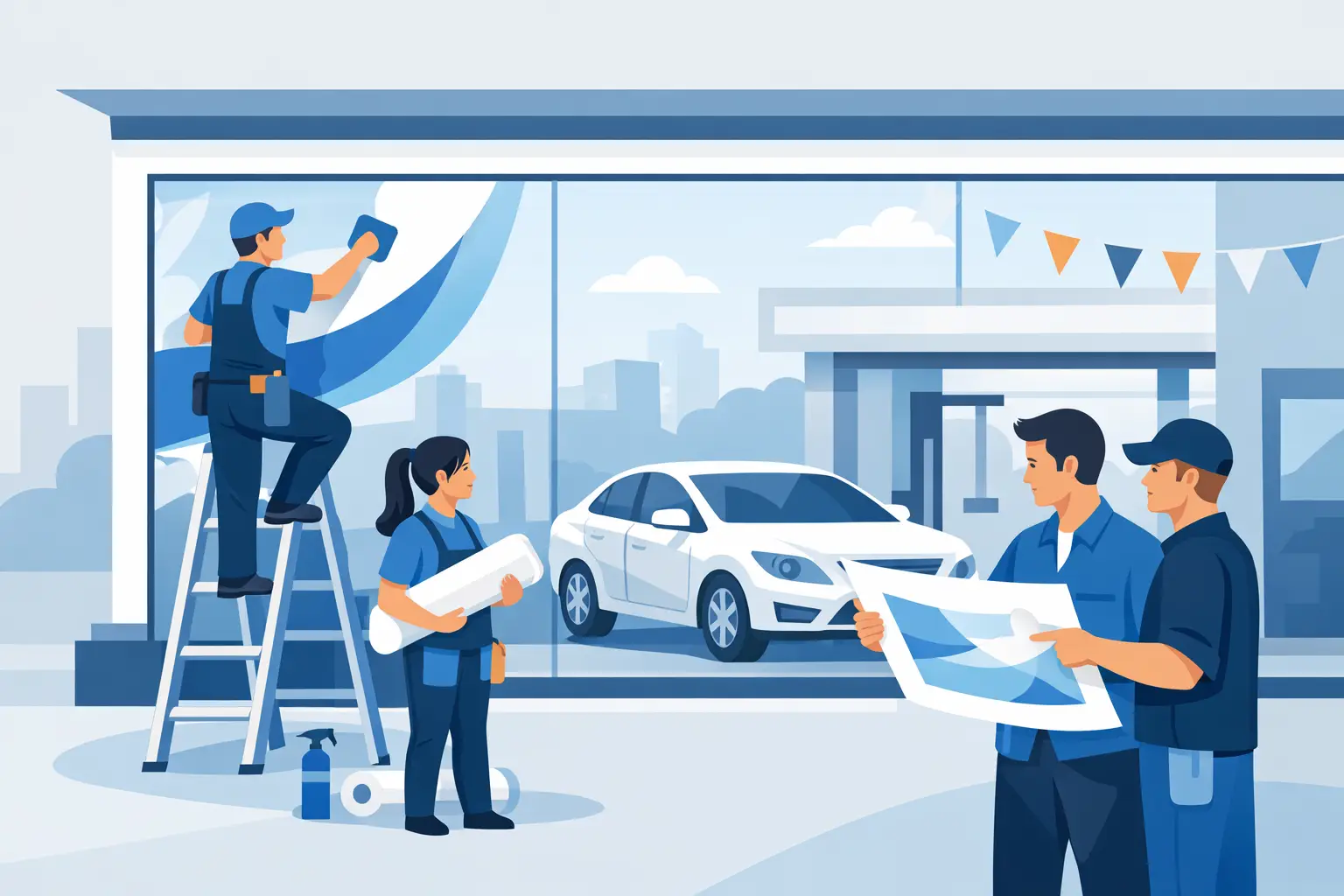
Accurate measurements prevent costly reprints. Measure the usable glass area, not just the entire window frame. Account for handles, mullions, sensors, door swings, and sightlines. Take photos of the location and note whether the graphic will be viewed from inside, outside, on foot, or from a vehicle.
Clean glass thoroughly before installation. Dust, silicone residue, and cleaning-product buildup can interfere with adhesion and leave visible imperfections. Installers should also check weather conditions when applying exterior graphics. Cold temperatures, rain, and excessive heat can affect handling and final results.
Once installed, add graphics to a simple review schedule. Check for lifting corners, fading, scratches, and outdated offers. This matters most on high-touch entrance doors and glass near the service lane. Replacing a damaged message quickly is part of keeping the whole dealership looking organized.
A practical supplier can help make this process repeatable. StickerPlanet Canada produces durable custom window graphics along with the service reminders and printed materials dealerships use every day, making it easier to keep messages consistent across customer touchpoints.
A Simple Approval Process Prevents Expensive Mistakes
Give one person or small team final approval over window messaging. Service, sales, and marketing may all have valid needs, but uncoordinated signs create clutter. Set standards for approved logo use, type sizes, color choices, offer dates, and who is responsible for removing expired graphics.
Before printing, confirm the message, dimensions, material, application side, quantity, and location. Then ask one final question: what should the customer do after seeing this? If the answer is not immediate, simplify the design.
The best window graphic does not need to be flashy. It needs to help a customer find the right place, understand the next step, or remember a service worth booking. When each piece of glass has a clear purpose, your dealership looks easier to do business with.