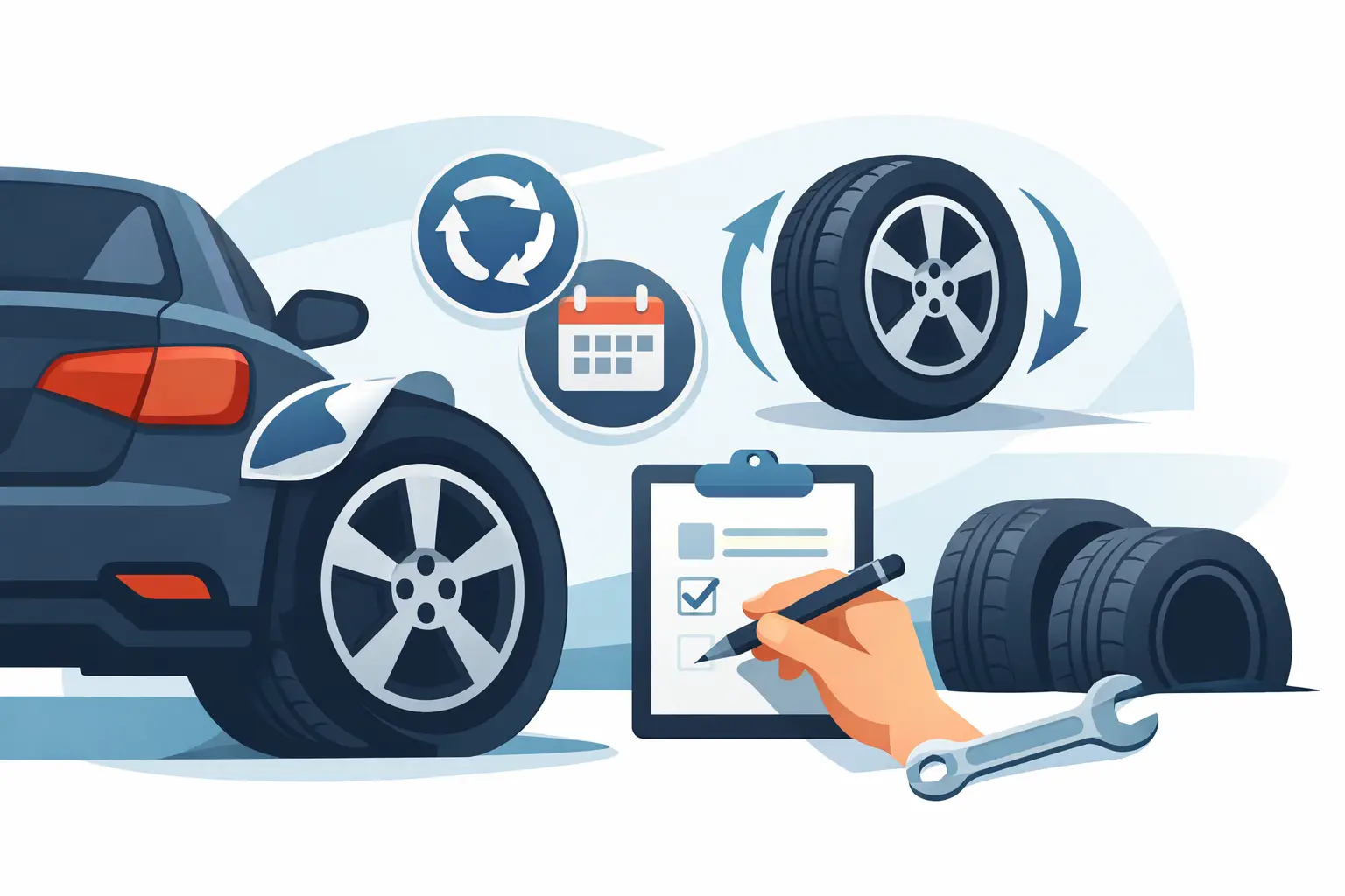
A dealer ID label has a small job with a big payoff. It sits on the vehicle, gets seen by the customer, and keeps your dealership or service department in front of them long after the visit. If you are figuring out how to design dealer id labels, the goal is not to make them flashy. The goal is to make them clear, durable, and useful every time they leave your shop.
That matters because a poor label gets ignored. A good one quietly does its work – reminding customers who serviced the vehicle, making your contact details easy to find, and supporting repeat business without adding extra work for your team.
What dealer ID labels need to do
A dealer ID label is not just a logo sticker. In most shops, it functions as a service reminder, a branding piece, and a practical reference point. Customers may use it to call for their next appointment, confirm where they bought the vehicle, or identify who last serviced it.
That means the design has to serve the real use case. You need enough information to be helpful, but not so much that the label becomes cluttered. You also need to think about where the label will be applied. A clean layout that looks good on a screen can still fail if the print is too small to read on a door jamb, windshield area, or another tight location.
How to design dealer ID labels with the right information
The first step in how to design dealer id labels is deciding what belongs on the label and what does not. Most businesses try to fit too much into a small format. That usually weakens the result.
At minimum, your label should include your business name and a phone number. For many dealers and service departments, the city or location also helps, especially if the group has multiple stores. If you want to add a website, keep it short and easy to read. If your logo is recognizable, include it, but do not let it crowd out the contact details.
Some shops also add a short service cue such as “Serviced by” or “Next service call.” That can work well when the label is meant to do more than identify the dealer. The trade-off is space. If your label size is limited, every extra line reduces readability.
A simple rule helps here: if the customer would realistically use the information later, keep it. If it is only there because it looks official, leave it out.
Keep the layout readable at a glance
Most dealer ID labels are read quickly, often from an awkward angle. That changes how you should design them. Readability matters more than decoration.
Start with a strong visual hierarchy. The business name should usually be the most prominent element, followed by the phone number. Secondary information, such as address details or a short tagline, should be smaller but still readable. If everything is the same size and weight, nothing stands out.
Font choice matters too. Clean sans serif fonts tend to perform best in small-format print because they stay legible at reduced sizes. Script fonts, condensed typefaces, and overly stylized lettering may match a brand on paper, but they often break down on labels. If your service advisor has to squint to read the proof, the customer will too.
Spacing is just as important as type size. Labels fail when text is pushed too close to the edges or packed too tightly together. A little breathing room makes the label look more professional and easier to scan.
Match the label to your brand without overdesigning it
A dealer ID label should feel like it belongs to your business. That does not mean it needs a full brand presentation squeezed into two inches.
Use your standard logo if it reproduces well at small size. Stick with one or two brand colors rather than trying to recreate an entire marketing layout. High contrast usually wins. Dark text on a light background or light text on a dark solid field tends to print cleanly and hold readability over time.
If your brand uses metallics, gradients, or fine details, test them carefully. Those elements can work in larger print pieces, but on small labels they often lose clarity. In many cases, a simpler version of your logo will produce a better result.
There is also a practical side to brand consistency. If your oil change stickers, tire labels, reminder decals, and dealer ID labels all use the same visual language, customers start to recognize your business faster. That consistency supports retention without requiring a hard sales message.
Choose the right size and shape for the job
Label design is tied to label format. A layout that works on a wide rectangle may not work on a square or oval. Before finalizing the artwork, decide where the label will be used and how much space is truly available.
Rectangular labels are often the easiest option because they give you room for a business name and contact details in a clean line structure. Ovals and custom shapes can look polished, but they leave less efficient space for text. If your priority is readability, a standard shape usually gives better value.
Size is a trade-off. Smaller labels are subtle and economical, but they limit content. Larger labels offer better visibility, but they can feel intrusive if placed in a tight or prominent area. For most dealer ID applications, a modest size with clear type is the better call than a large label packed with extra messaging.
Material and adhesive choices affect the design
When people think about how to design dealer id labels, they often focus only on artwork. In practice, material choice affects the success of the label just as much.
If the label will face heat, sunlight, moisture, or regular handling, choose a stock built for that environment. Durable materials with quality adhesive help the label stay clean, readable, and attached where it belongs. That matters for customer perception. A label that curls, fades, or peels early reflects poorly on the business printed on it.
Finish also influences appearance. Gloss can give colors more punch, while matte may reduce glare and improve readability under bright light. There is no universal winner. If your labels are likely to be viewed through glass or under direct sun, glare can become a real issue, so matte may be the smarter operational choice.
Design for repeat ordering and easy approval
One of the most overlooked parts of label design is repeatability. If you expect to reorder dealer ID labels regularly, keep the design easy to reproduce and easy to approve.
That means using stable brand assets, standard colors, and a layout that does not require constant adjustment. If several locations or departments will use the same base design, build a version that allows small detail changes without rebuilding the entire file.
This is especially useful for dealer groups, multi-location service operations, or shops that want matching printed materials across departments. A dependable template saves time, reduces proofing errors, and keeps the final product consistent. For operations-focused buyers, that is not a minor benefit. It is part of running a tighter process.
Common mistakes when designing dealer ID labels
The biggest mistake is trying to turn a small label into a full advertisement. Long taglines, too many phone numbers, oversized logos, and low-contrast colors all work against the label’s purpose.
Another issue is designing only for appearance, not for use. A label may look sharp in a digital mockup but fail once printed small. Thin lines disappear. Small text fills in. Busy backgrounds reduce contrast. This is why proofing at actual size matters.
There is also the problem of weak material decisions. Even a strong design loses value if the stock is not suited to everyday dealership or shop conditions. A professional label should hold up through normal service life, not just look good on day one.
How to approve a design with fewer problems
Before placing a full order, review the design the way a customer will experience it. Print a sample at actual size. Hold it at arm’s length. Check whether the business name and phone number are readable in a few seconds. If not, simplify.
Look closely at alignment, spacing, and logo clarity. Confirm that the contrast is strong enough and that no important text sits too close to the cut line. If multiple people in your operation approve printed materials, get sign-off early so the job does not stall later.
Working with a print supplier that understands automotive labels can make this easier. A company that produces service reminder products every day will usually spot sizing, material, and readability issues before they become expensive mistakes. That is one reason many shops rely on specialized suppliers like StickerPlanet Canada for repeat-use label products.
A dealer ID label does not need to be complicated to be effective. It needs to be readable, durable, and tied to the way your business actually operates. If the customer can quickly see who you are and how to reach you, the label is doing its job. Start there, keep the design tight, and let the quality of the print carry the message.